“Body and voice letters lend to silent thought, through centuries’ streams it is carried by the speaking page.” — This might be the most popular quote used to illustrate German type specimens. I have far less demanding claims than Friedrich Schiller regarding the timespan, but I do agree from the bottom of my heart that when it comes to honoring their potential power, letters have to incarnate body and voice.
Merchants used to pace back and forth in front of their shops, shouting aloud and praising their products. This type of communication became increasingly unfashionable between companies and customers. Letters for the most part have replaced this very direct approach. But beware: letters in front of your shop can also yell at customers instead of warmly inviting them inside. Giving letters the right body while adjusting the pitch is where I see my most important commission.
Just as in daily life, letters as a voice, carry the identity of a speaker. Every voice is unique and recognizable. On the other hand, everyone adjusts his pitch according to the situation: you don’t wish your darling goodnight the same way you draw attention to yourself when you see friends passing by half a mile away.
So how does that translate to the visual identity of corporations? Good news first: everything is possible. The letter world offers so many solutions where every situation can be remedied by finding a model or drawing it.
Logotypes
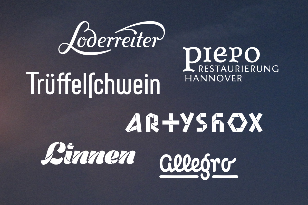
The visual power and urgency of logotypes is often underestimated when it comes to giving a visual appearance to businesses, brands and products. The aim of creating logotypes is to create a pictorial entity that is recognizable and brings about identity. Pitch has to be adjusted according to the distance that lies between transmitter and recipient.
Display fonts
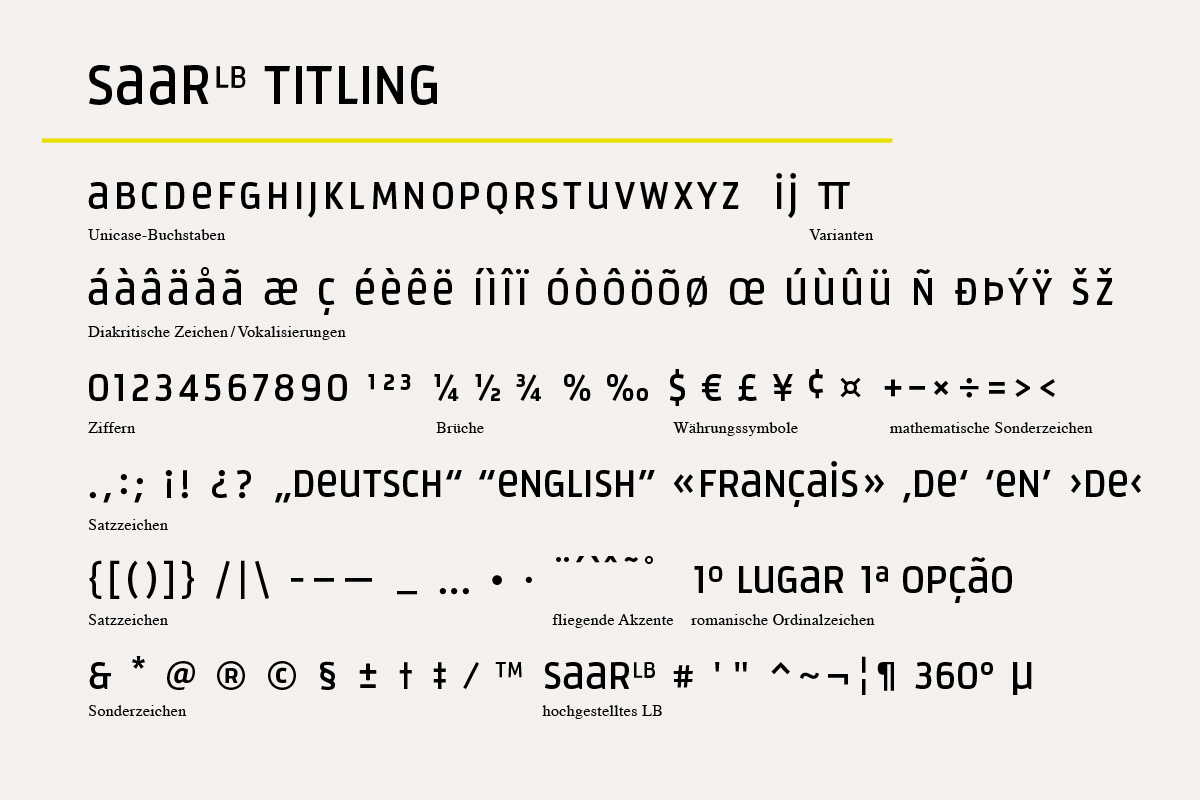
“To put something on display” means to exhibit something, to lift it up and point it out. Accordingly, a display font is a font of rather loud pitch. This doesn’t say anything yet about its semantic value, which can be defined in the design process. Basically, display fonts have to work like text fonts. That means that it’s not about creating outstanding single images, but rather about conceiving a set of signs in which all the signs combine equally well.
That’s why display fonts carry less idiosyncrasies than letterings and logotypes, yet they can still emboss a brand identity. A display font puts a brand’s identity on solid footing, as it may be used in various media to further carry its sender’s voice. Development costs are kept at a manageable rate, as display fonts do not need to fulfill the same requirements as text typefaces for continuous reading.
Corporate typefaces for continuous reading
A corporate typeface can be a display font, though it doesn’t have to be. A corporate typeface can also be a face meant for continuous reading, where the recipient would rather pay attention to the content than to the sender’s voice. A corporate typeface can be chosen from the rich existing pool of fonts. It also can be designed in a more individual—and therefore more identity-establishing—way by means of modifying an existing typeface. Or it can be drawn completely from scratch.
At best a corporate text typeface would comprise at least the regular, bold and italic cuts to allow the sender the full opportunity to adjust or modulate his or her voice at a short distance.
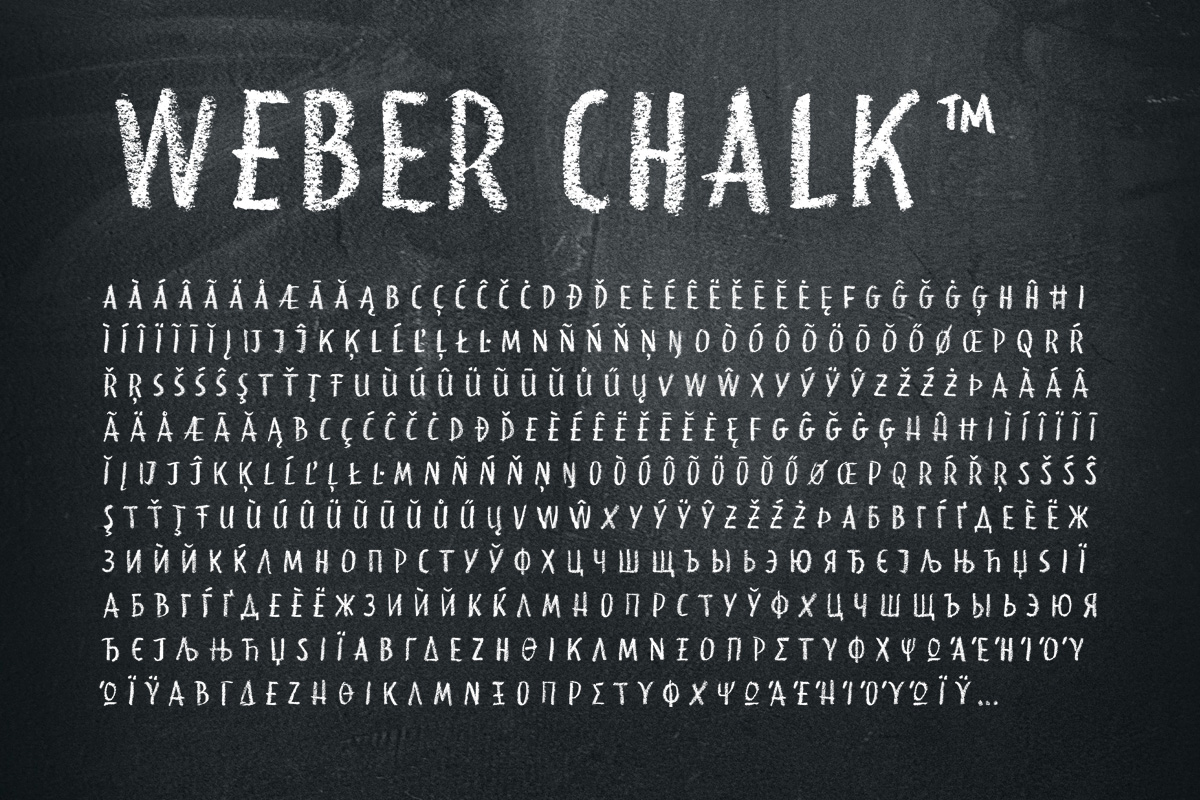
The development costs for corporate text typefaces depend on the number of signs and cuts that need to be drawn. For Northern and Western Europe and the Americas, the minimum standard is about 256 signs. For Central and Eastern Europe additional signs and diacritic marks are needed. Global players should consider extending to non-Latin writing systems like Greek, Cyrillic, Arabic, Japanese and Chinese.
What do you want to say?
The world of letters is a comprehensive one. I look forward to consulting you on the solution that best suits your needs. For this purpose I need to know who you are, what you want to say, to whom you want to tell it, and from how far away your client is standing.
—————
This article first appeared on LetterinBerlin in November 2013. Find its German version here.


